Tuesday, 14 February 2017

Working with VB Namespaces

This article gives an overview on how to create flowcharts in Excel. There are significant differences between the tools in the newer versions of Excel and the older versions. Make sure that you read the appropriate section below. Most of the editing techniques are the same and are covered in the Editing Excel Flowcharts section at the bottom of the article. Most of the topics described here can also be applied to creating flowcharts in Word or PowerPoint, but in my humble opinion, of all the Office Drawing tools the Excel drawing tools are the most user friendly.


Setting Up The Environment

Before actually creating the flowchart, we will cover some preliminaries that make flowcharting in Excel a bit easier.
Creating a Grid (Optional)
A grid is not required, but it makes creating flowcharts with uniform shape sizes easier, especially when coupled with the Snap to Grid feature, which we will cover in the next section.
The grid is created by changing the column widths to match the standard row height. Assuming that you're using the default font of Calibri 11, the standard row height is 15 pts, which equals 20 pixels. To create the grid, change the column widths to 2.14 (= 20 pixels). (In case you're curious, the units for Excel column widths are based on the average number of characters that will fit within a cell.)
Enabling Snap
When Snap to Grid is turned on, anytime you add, move, or resize a shape, the edges of the shape will “snap” to the nearest grid line. Snap to Shape provides the same behavior, except shapes are snapped to the edges of other shapes. You can turn on both Snap to Grid and Snap to Shape by clicking the Page Layout tab, then click the Align dropdown, as shown in the image on the right.
Page Layout
Beyond the obvious reasons, setting the page layout before creating the flowchart is important for several reasons:
  • If you plan to copy the flowchart from Excel to Word, or some other application, matching the margins to the target is important. Word, for example, has different normal margins than Excel.
  • If the flowchart direction is left to right, the page layout is typically in landscape orientation.
  • When you display page breaks, they act as a visual boundary to check whether shapes fall within a page.
To set the layout, click the Page Layout tab and use the Margins, Orientation, and (paper) Size dropdowns to change the settings if needed.
Themes: Be careful changing the Theme on the Page Layout tab. It not only alters the font and color scheme, but it also changes the row heights and column widths, which will affect how many shapes fit on a page.

Creating the Flowchart

Inserting a Flowchart Shape
To add the first shape, starting by clicking the Insert tab, where you should see a Shapes dropdown button. Clicking the Shapes dropdown displays the gallery of shape types shown below.
You can add a shape to the worksheet either by double-clicking a shape in the gallery, or by single clicking a shape and drawing its outline on the worskheet while holding the left mouse button down. If you double-click to add the shape, the shape will be placed in a somewhat arbritrary location on the sheet and have a height of 0.67” and a width of 1.0”.
Adding More Flowchart Shapes
After you add the first shape, you'll notice that a Format tab (shown below) becomes available on the ribbon anytime that you click on a shape. We'll cover formatting in a bit, but in regard to adding shapes, the Format tab duplicates the Shapes gallery that we saw above. This makes it handy to add a shape then continue to add shapes in serial fashion.
Format Tab
Adding Text to a Shape
This is straightforward - just click on the shape and start typing. If you need to edit the text in the shape click in the center of the shape, and not on the edges. Clicking the text in the center will put you into edit mode, but clicking the shape's border will select the shape itself.
Adding Connector Arrows Between Shapes
Connector arrows are added to the worksheet the same way flowchart shapes are - via the Shapes gallery. After clicking the line type in the gallery, follow these steps to add it to the flow diagram:
  1. Hover the mouse over the first shape and you will see the available connection points highlighted by red dots. Click the left mouse button down on the desired connection point.
  2. While still holding the left mouse bbutton down, drag the line to the next shape, where again the connection points are highlight.
  3. Release the left mouse button on a connection point, and the line will be selected with both end points highlighted by red dots. If an endpoint has a clear dot, it indicates that the connector wasn't connected.
Adding Labels and Callouts
There are two common ways to add notes to a flowchart.
  • Text box labels: text box
  • Callouts: text box
Text boxes are often used to label the connectors coming out of decisions. Callouts are commonly used to add side comments, with their shape indicating that they are not a process step. Both can be added via the Insert Shapes gallery.

Formatting the Flowchart

There are so many formatting options in Excel, that it's too much to cover in a single article. The sections below show how to do basic shape and line formatting. There is a special dialog worth mentioning. If you right-click on a shape and select Format Shape from the context menu, the format dialog will display and let you make changes to a wide
Formatting Shapes
When one or more shapes is selected, the Format tab displays the style gallery shown below. Note that the styles changed in Excel 2013. The shape styles are set by their theme number, so if you use one of the purple styles in Excel 2010, for example, and then open it in Excel 2013 or Excel 2016, it will display with the new orange theme.
If you are sharing the document with Excel 2003 users, note that the last row of styles will not render well in Excel 2003. If you are sharing the file with Excel 2000 users (i.e., the file is saved in .xls compatibility mode), the last two rows of styles will not render well.

Monday, 13 February 2017

In Excel Create a New Shortcut Menu

Generally there are three shortcuts in the top menu, which are Save, Undo Typing and Repeat Typing. However, if you want to use more shortcuts, like Copy and Cut, you can set them up as follows:
File->Options->Quick Access Toolbar, add Cut and Copy from the left column to the right, save it. You will see two more shortcuts added in the top menu.

VLOOKUP function

How to get started

There are four pieces of information that you will need in order to build the VLOOKUP syntax:
  1. The value you want to look up, also called the lookup value.
  2. The range where the lookup value is located. Remember that the lookup value should always be in the first column in the range for VLOOKUP to work correctly. For example, if your lookup value is in cell C2 then your range should start with C.
  3. The column number in the range that contains the return value. For example, if you specify B2: D11 as the range, you should count B as the first column, C as the second, and so on.
  4. Optionally, you can specify TRUE if you want an approximate match or FALSE if you want an exact match of the return value. If you don't specify anything, the default value will always be TRUE or approximate match.
Now put all of the above together as follows:
=VLOOKUP(lookup value, range containing the lookup value, the column number in the range containing the return value, optionally specify TRUE for approximate match or FALSE for an exact match).
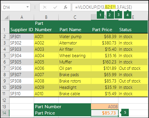
The following picture shows how you'd set up your VLOOKUP to return the price of Brake rotors, which is85.73.
VLOOKUP example
  1. D13 is lookup_value, or the value you want to look up.
  2. B2 to E11 (highlighted in yellow in the table) is table_array, or the range where the lookup value is located.
  3. 3 is col_index_num, or the column number in table_array that contains the return value. In this example, the third column in the table array is Part Price, so the formula output will be a value from the Part Price column.
  4. FALSE is range_lookup, so the return value will be an exact match.
  5. Output of the VLOOKUP formula is 85.73, the price of Brake rotors.

Examples

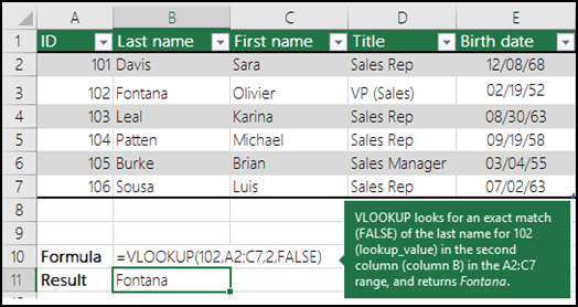
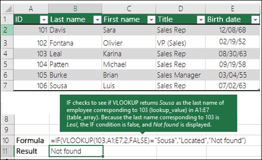
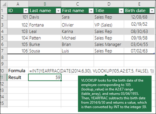
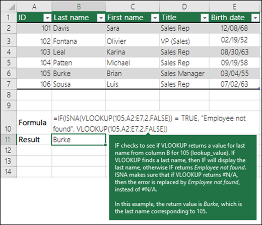
Here are a few more examples of VLOOKUP:

Example 1

VLOOKUP Example 1

Example 2

VLOOKUP Example 2

Example 3

VLOOKUP Example 3

Example 4

VLOOKUP Example 4

Example 5

VLOOKUP Example 5

Excel As A Calculator

OK, I know the tag-line for this website is “…because it’s more than just a calculator”.  Of course this is in reference to the almost endless number of functions that Excel can calculate when compared to a standard calculator.  That isn’t to say though that Excel can’t calculate things just as well as a standard calculator.
For example, when balancing a checkbook, you could write out your bank balance and manually add or subtract the deposits and checks that haven’t cleared the bank yet.  Or, you could type your bank balance into Excel, type the list of checks and deposits and have Excel do the math for you.
You could also add a list of numbers together in one cell the opposite way from how you would calculate them on a calculator.  If you have the following list of numbers: 8, 17, 49, 32, 19, you would add them on a calculator by typing 8+17+49+32+19= to produce 125.  In Excel, the equals sign is on the opposite side of the equation.  You simply type =8+17+49+32+19 hit Enter and the cell will display the result, 125.
You can do this with all the familiar operators found on a calculator (add, subtract, multiply, and divide), as follows.
OperatorCalculator InputExcel Formula
Add (+)5+5==5+5
Subtract (-)5-5==5-5
Multiply (*)5×5==5*5
Divide (/)5÷5==5/5
So, while Excel is more than just a calculator, it can still perform various functions like a calculator.

Customizing a Pivot Table in Excel 2016

This chapter from Excel 2016 Pivot Table Data Crunching covers how you can use many powerful settings to tweak pivot tables. These tweaks range from making cosmetic changes to changing the underlying calculation used in the pivot table.

In This Chapter                                                                         


  1. In This Chapter
  2. Making Common Cosmetic Changes
  3. Making Report Layout Changes
  4. Customizing a Pivot Table’s Appearance with Styles and Themes
  5. Changing Summary Calculations
  6. Adding and Removing Subtotals
  7. Changing the Calculation in a Value Field

Making Common Cosmetic Changes

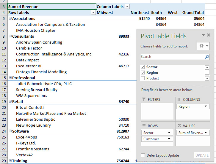
You need to make a few changes to almost every pivot table to make it easier to understand and interpret. Figure 3.1 shows a typical pivot table. To create this pivot table, open the Chapter 3 data file. Select Insert, Pivot Table, OK. Check the Sector, Customer, and Revenue fields, and drag the Region field to the Columns area.
Figure 3.1 A typical pivot table before customization.
This default pivot table contains several annoying items that you might want to change quickly:
  • The default table style uses no gridlines, which makes it difficult to follow the rows and columns across and down.
  • Numbers in the Values area are in a general number format. There are no commas, currency symbols, and so on.
  • For sparse data sets, many blanks appear in the Values area. The blank cell in B5 indicates that there were no Associations sales in the Midwest. Most people prefer to see zeros instead of blanks.
  • Excel renames fields in the Values area with the unimaginative name Sum of Revenue. You can change this name.
You can correct each of these annoyances with just a few mouse clicks. The following sections address each issue.

Applying a Table Style to Restore Gridlines

The default pivot table layout contains no gridlines and is rather plain. Fortunately, you can apply a table style. Any table style that you choose is better than the default.
Follow these steps to apply a table style:
  1. Make sure that the active cell is in the pivot table.
  2. From the ribbon, select the Design tab. Three arrows appear at the right side of the PivotTable Style gallery.
  3. Click the bottom arrow to open the complete gallery, which is shown in Figure 3.2.
  1. Figure 3.2 The gallery contains 85 styles to choose from.
  2. Choose any style other than the first style from the drop-down. Styles toward the bottom of the gallery tend to have more formatting.
  3. Select the check box for Banded Rows to the left of the PivotTable Styles gallery. This draws gridlines in light styles and adds row stripes in dark styles.
It does not matter which style you choose from the gallery; any of the 84 other styles are better than the default style.

Changing the Number Format to Add Thousands Separators

If you have gone to the trouble of formatting your underlying data, you might expect that the pivot table will capture some of this formatting. Unfortunately, it does not. Even if your underlying data fields were formatted with a certain numeric format, the default pivot table presents values formatted with a general format. As a sign of some progress, when you create pivot tables from PowerPivot, you can specify the number format for a field before creating the pivot table. This functionality has not come to regular pivot tables yet.
For example, in the figures in this chapter, the numbers are in the thousands or tens of thousands. At this level of sales, you would normally have a thousands separator and probably no decimal places. Although the original data had a numeric format applied, the pivot table routinely formats your numbers in an ugly general style.
CAUTION                                                                    
 You will be tempted to format the numbers using the right-click menu and choosing Number Format. This is not the best way to go. You will be tempted to format the cells using the tools on the Home tab. This is not the way to go. Either of these methods temporarily fixes the problem, but you lose the formatting as soon as you move a field in the pivot table. The right way to solve the problem is to use the Number Format button in the Value Field Settings dialog.
You have three ways to get to this dialog:
  • Right-click a number in the Values area of the pivot table and select Value Field Settings.
  • Click the drop-down to the right of the Sum of Revenue field in the areas of the PivotTable Fields list and then select Value Field Settings from the context menu.
  • Select any cell in the Values area of the pivot table. From the Analyze tab, select Field Settings from the Active Field group.
As shown in Figure 3.3, the Value Field Settings dialog is displayed. To change the numeric format, click the Number Format button in the lower-left corner.
Figure 3.3
Figure 3.3 Display the Value Field Settings dialog, and then click Number Format.
In the Format Cells dialog that appears, you can choose any built-in number format or choose a custom format. For example, you can choose Currency, as shown in Figure 3.4.
Figure 3.4
Figure 3.4 Choose an easier-to-read number format from the Format Cells dialog.

Replacing Blanks with Zeros

One of the elements of good spreadsheet design is that you should never leave blank cells in a numeric section of a worksheet. Even Microsoft believes in this rule; if your source data for a pivot table contains one million numeric cells and one blank cell, Excel 2016 treats the entire column as if it is text and chooses to count the column instead of sum it. This is why it is incredibly annoying that the default setting for a pivot table leaves many blanks in the Values area of some pivot tables.
A blank tells you that there were no sales for a particular combination of labels. In the default view, an actual zero is used to indicate that there was activity, but the total sales were zero. This value might mean that a customer bought something and then returned it, resulting in net sales of zero. Although there are limited applications in which you need to differentiate between having no sales and having net zero sales, this seems rare. In 99% of the cases, you should fill in the blank cells with zeros.
Follow these steps to change this setting for the current pivot table:
  1. Right-click any cell in the pivot table and choose PivotTable Options.
  2. On the Layout & Format tab in the Format section, type 0 next to the field labeled For Empty Cells Show (see Figure 3.5).
    Figure 3.5
    Figure 3.5 Enter a zero in the For Empty Cells Show box to replace the blank cells with zero.
  3. Click OK to accept the change.
The result is that the pivot table is filled with zeros instead of blanks, as shown in Figure 3.6.
Figure 3.6
Figure 3.6 Your report is now a solid contiguous block of non-blank cells.

Changing a Field Name

Every field in a final pivot table has a name. Fields in the row, column, and filter areas inherit their names from the heading in the source data. Fields in the data section are given names such as Sum of Revenue. In some instances, you might prefer to print a different name in the pivot table. You might prefer Total Revenue instead of the default name. In these situations, the capability to change your field names comes in quite handy.
To change a field name in the Values area, follow these steps:
  1. Select a cell in the pivot table that contains the appropriate type of value. You might have a pivot table with both Sum of Quantity and Sum of Revenue in the Values area. Choose a cell that contains a Sum of Revenue value.
  2. Go to the Analyze tab in the ribbon. A Pivot Field Name text box appears below the heading Active Field. The box currently contains Sum of Revenue.
  3. Type a new name in the box, as shown in Figure 3.7. Click a cell in your pivot table to complete the entry, and have the heading in A3 change. The name of the field title in the Values area also changes to reflect the new name.
    Figure 3.7
    Figure 3.7 The name typed in the Custom Name box appears in the pivot table. Although names should be unique, you can trick Excel into accepting a name that’s similar to an existing name by adding a space to the end of it.